- •
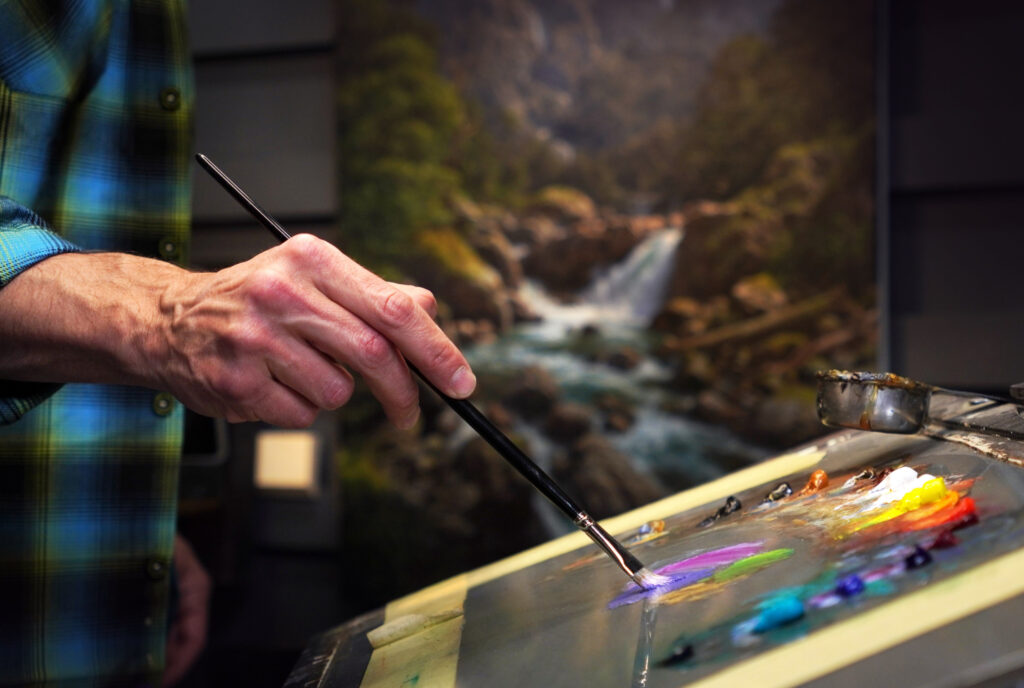
Starting out with oil painting can feel overwhelming — so many colors, so many brands, and way too many opinions. I get it. When I began, I wanted to use everything. But over the years, I’ve pared it back to a core palette that gives me flexibility without the confusion.
In this article, I’ll walk you through the colors I use the most, why I prefer single-pigment paints, and how to avoid common beginner traps. the beauty of this challenge. It doesn’t rely on inspiration. It forces you into discipline. You have to find a way to sit down, even when the drawing from the day before didn’t work. Even when you’d rather avoid the paper.
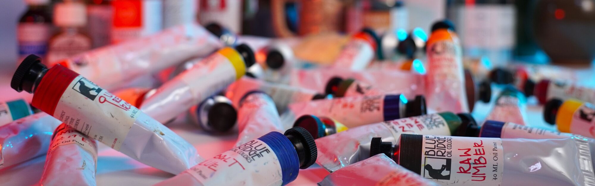
The Palette That Does It All
When I’m painting — whether a landscape, portrait, or still life — I reach for these go-to colors again and again. They give me a full range of temperature and value, without cluttering my workflow.
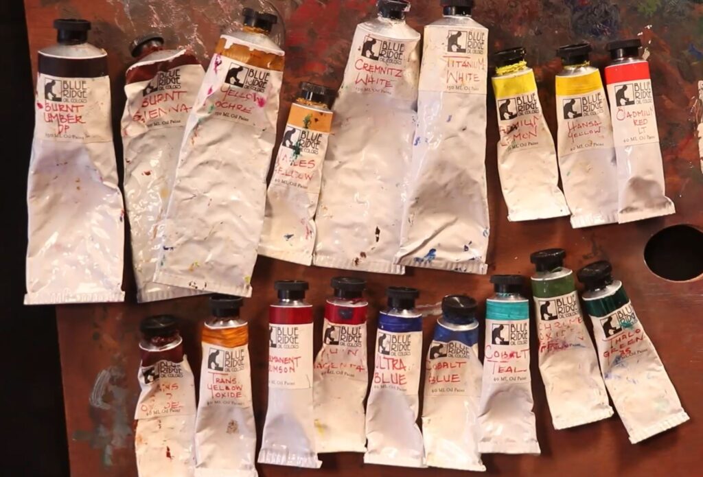
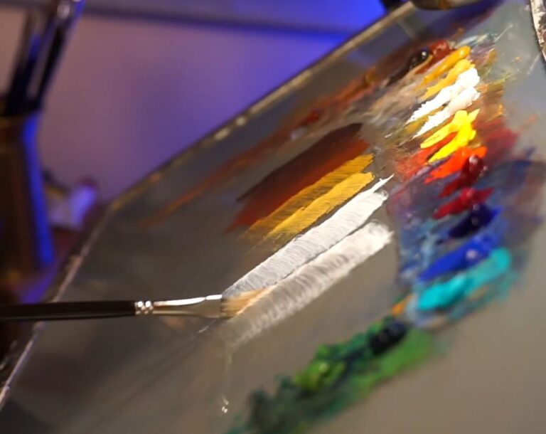
Here’s a quick rundown of what’s on that palette:
Burnt Umber – Earthy and dark. I use this all the time to knock down intensity and even mix it with Ultramarine Blue to create a beautiful soft black.
Burnt Sienna – A warm reddish tone. Great for underpainting and skin tones.
Yellow Ochre – My secret weapon for skin tones and natural-looking greens. It’s gentle and versatile.
Cadmium Lemon – A sharp, bright yellow that brings sunlight to any mix.
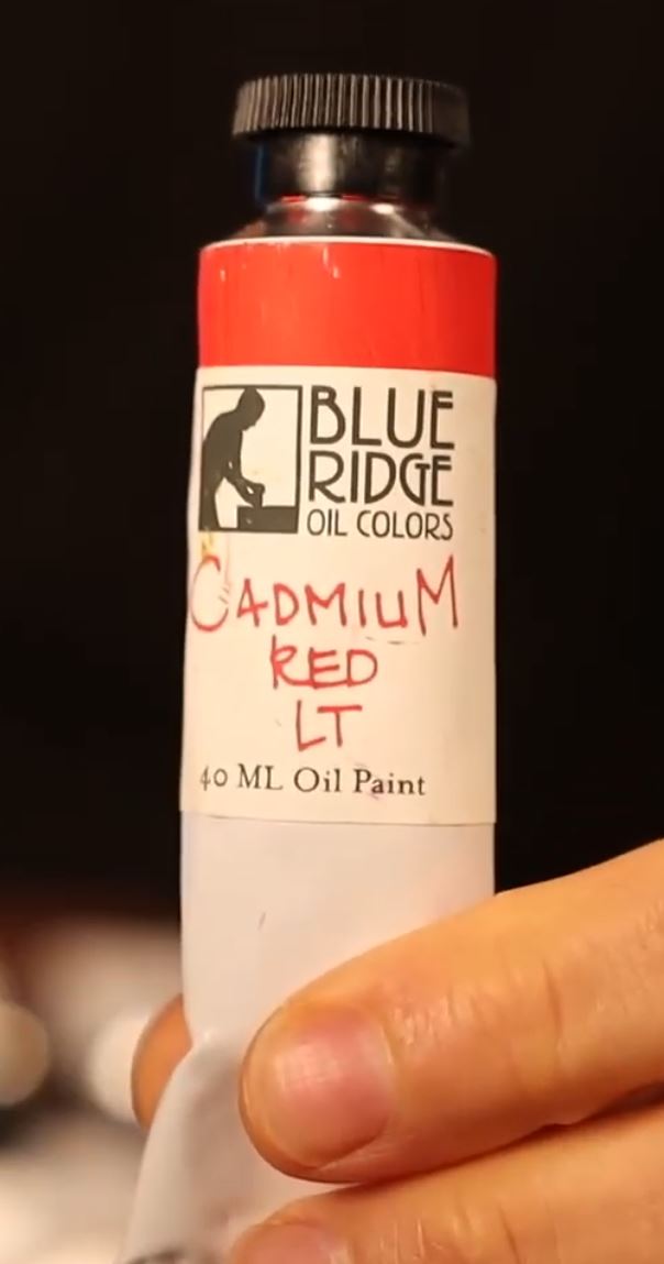
Cadmium Red – The real deal. Bold, vivid, and powerful.
Cobalt Blue – Mid-range blue, perfect for skies and subtle greens.
Ultramarine Blue – Cooler and deeper than Cobalt. Great for shadows.
Titanium White – Punchy and opaque, but I often mix it with Lead White for more subtle transitions.
I rarely go outside this palette unless I need a special effect.
Why I Stick to Single-Pigment Paints
You’d be surprised what’s hiding inside some of those paint tubes. Many student-grade or “hue” paints are actually a cocktail of pigments, fillers, and marketing fluff. When a tube says “Cadmium Red Hue,” it might look like cadmium at first glance… but it’s not the real thing.
I prefer single-source pigments. These paints contain just one pigment type — nothing else. That gives me clean, predictable mixes and more control. When I mix blue and yellow, I want green — not gray mush. Beginners especially benefit from this clarity.
Want to know a fun test? Try mixing purple from different reds and blues. You’ll really notice the difference if you’re using muddier multi-pigment tubes.
The Paints I Trust
For years, I’ve used Blue Ridge Oil Paints, handmade in North Carolina. Eric Silver, the maker, keeps his formulas clean and consistent — no gimmicks, just pigment and oil. But if you can’t get your hands on Blue Ridge, that’s okay. Just make sure the label says artist grade, and avoid any tube that uses the word “hue.”
Check your local art store or online. Read the pigment codes (they’ll say things like PR108 for Cadmium Red). A little research goes a long way toward quality.
A Note on Whites — Yes, It Matters
Not all whites are equal. I use two: Titanium White (super strong and opaque) and Lead White (also called Cremnitz White — softer, more transparent, and beautifully subtle). Sometimes I mix them 50/50 for the best of both worlds.
Lead sounds scary, I know. But when handled properly, it’s safe — just don’t eat it, breathe it, or rub it on your toast.
Titanium can be a bit of a bully in mixes, especially with skin tones. That’s why I keep Lead White around — it plays nicely with others and gives a more luminous effect. The Old Masters knew what they were doing.
Build Your Kit with Intention
When you’re just starting out, the temptation is to get everything. Don’t.
Start with fewer, better paints. Learn how they behave. Understand how to mute colors, mix complements, and shift temperature. That’s where the magic happens — not in the number of tubes.
Want to Go Deeper?
If you’re eager to take the next step and truly understand your materials and how to use them, I cover all of this in my Oil Painting Fundamentals course at Tisch Academy. It’s designed for beginners and will guide you from palette setup to finished painting — with plenty of demos along the way.
👉 Learn more at Tisch Academy and start your journey in oil painting the right way.
Final Thoughts
Don’t stress about having the perfect palette. Instead, get to know your paints, learn what they do, and enjoy the process. The joy of oil painting is in the mixing, experimenting, and discovering how each pigment behaves. With a solid starting point, you’ll go further, faster.
Tisch
Never Miss a Post!
Keep up to date with videos, livestreams, blog posts, print drops and much more!